A KIND OF BEETLE MANIA
The 1960’s Volkswagen Beetle campaigns grabbed the advertising rule book, tore it into pieces and set fire to the shreds. These brilliantly simple, stunningly effective works of art forever changed the advertising landscape. But what made them so appealing and why are they still relevant today?
The bug was catching
In 1953, sales of Volkswagen’s in the United States hovered at around 2,000 units. However, thanks to concentrated dealer and distributor advertising, this figure had jumped to 150,000 by 1958. The quirky bug-like car from Europe ruffled enough feathers in Detroit for Ford, General Motors and Chrysler to design their own versions of a compact car for America’s motorists.
The man from VW
To counter this change of direction by Detroit, Carl Hahn, President of Volkswagen America decided that the best form of defence was attack. For the first time in the US, Volkswagen would advertise directly to the American consumer. Hahn spent three months meeting with America’s ‘finest’ admen but their formula driven, introspective approach failed to impress the man from VW. A chance conversation with a distributor in New York led Hahn to a bunch of creatives who were ignoring the noise coming from Maddison Avenue.
When everyone else zigs, zag
Doyle, Dane, Bernbach (DDB), a New York based agency enjoyed a reputation for unusual, highly effective creative work for a portfolio of smallish, quirky clients. Whether intentionally or not DDB had become a champion for the underdog and were an instant hit with Hahn. It’s worth noting that unlike most other agencies Hahn approached, DDB didn’t produce speculative VW designs and instead relied on their portfolio. Which perhaps underlines a point relevant still today, that finding an agency in tune with your thinking is far more valuable than a series of speculative pitches.

Yours sincerely, Bob
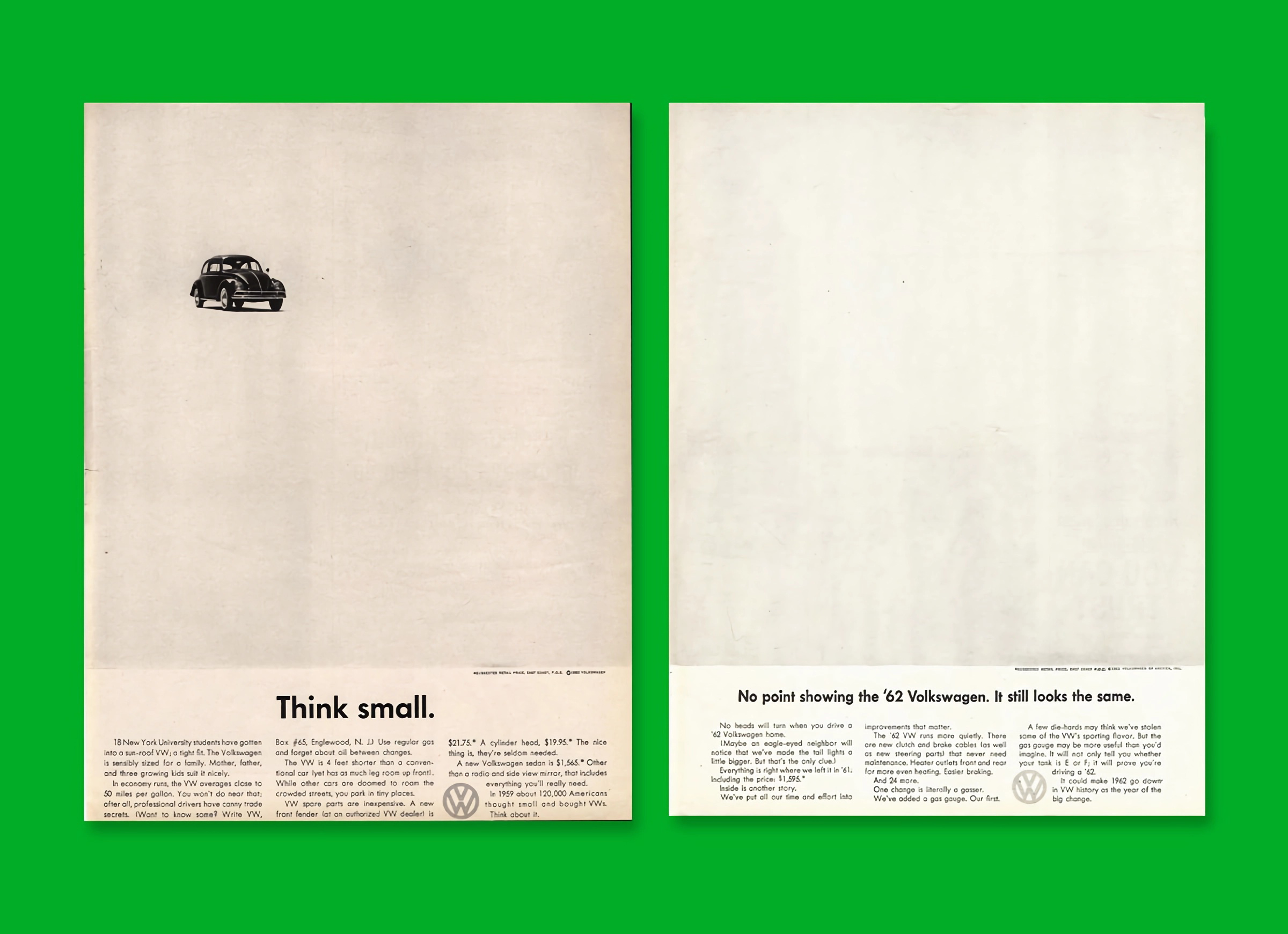
The first team at DDB to work on the VW account were art director Helmut Krone, copywriter Julien Koenig and creative director Bill Bernbach. They created a tone of voice that was friendly, straightforward and disarmingly honest. Full stops punctuated the headlines, encouraging the reader to pause before reading on.
The copy spoke directly to the reader, treating them as though they were smart enough to work it out for themselves. Another copywriter, Bob Levinson took things further by writing the copy as if he were writing a letter to his best friend. He would start Dear Charlie, write the copy, sign off Yours sincerely, Bob, delete the salutation and sign off and there you had it, a VW advert.
Setting the narrative
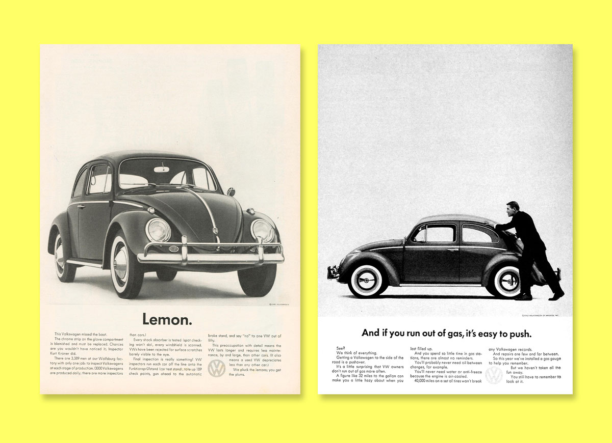
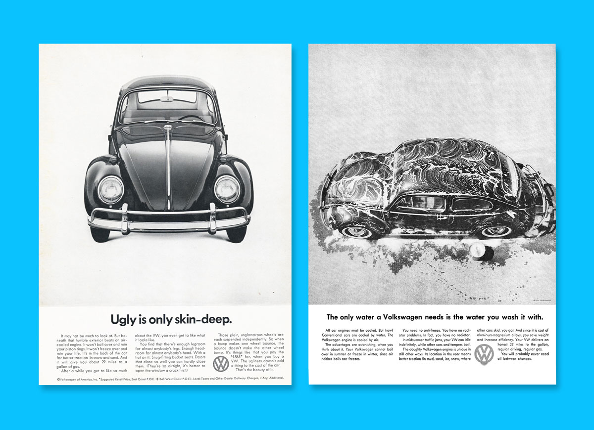
If you are writing to your best friend, there’s no point in hiding the truth. DDB created a narrative that took the negatives of the Beetle and turned them into resounding positives, delivered in a self-deprecating manner.
DDB made fun of the unorthodox qualities of the Beetle. They were happy to show the car in imperfect condition – damaged, dirty, minus a few parts or in situations that worked against it until you read the copy.
Crafting the look
Helmut Krone was a Bauhaus influenced art director. Therefore VW adverts were neat and followed a simple layout, the typeface was sans serif, in this case Futura. The logo was set awkwardly between the second and third columns of copy; Krone deliberately positioned the logo where the reader wouldn’t expect to see it.
At that time most car adverts relied on illustrations or heavily retouched photography. VW photography was realistic, shot in black and white with minimal retouching, there were no models unless the shot required them, no fancy backgrounds, nothing but the car. Sometimes there was no car at all.
A topic of conversation
This new style of advertising tapped into the sense of disconnect that the American public were feeling, due in part to the lack of understanding shown by mainstream advertising. VW print adverts gained unusually high readership, many dealers reported customers walking into their showrooms quoting the latest headline. The adverts became cultural icons as much as the cars.

Not just in print
“Have you ever wondered how the man who drives the snowplough drives to the snowplough?” Is the question set by DDB’s TV commercial for the Beetle. This insanely simple concept of a car driving through the snow to reach a snowplough became the benchmark for generations of creative and art directors.
The same humour written into a VW print ad was brought to life in further TV commercials, which ranged from game shows, a funeral and space travel to keeping up with the neighbours. Whatever the setting, the message was clear; you get more bang for your buck with a Volkswagen Beetle.
The acid test
Within 2 years of Ford, General Motors and Chrysler launching compact cars, sales of imported cars in the US had plummeted by nearly 50%. However, Carl Hahn’s belief that advertising could strengthen VW’s share was proved right as sales were increased by over 25%.
A beacon even today
There are perhaps a number of reasons why this work is still admired today, but chief amongst the roll call would be bravery. Watch or read any of the material generated by mainstream car brands today, bravery would not be a word that springs to mind. Rather like their cars, the majority of brands are happy to follow the same formulaic style, which offers nothing and speaks to nobody.
For creativity to thrive it takes bravery on all sides, the agency for sharing creative thoughts so different it scares them, the client for leaving their comfort zone in the quest for greater results. Daring to be different is surely what it’s all about. Bill Bernbach certainly thought so…
“The truth isn’t the truth until people believe you, and they can’t believe you if they don’t know what you’re saying, and they can’t know what you’re saying if they don’t listen to you, and they won’t listen to you if you’re not interesting, and you won’t be interesting unless you say things imaginatively, originally, freshly.” ![]()
Greensquare is a registered company in England.
© Greensquare 2024.
“Greensquare” and “Green Square” are the registered trademarks of Greensquare Brand Design Limited. All rights reserved.
Privacy Policy Sitemap DBA Member
Greensquare Brand Design Ltd
1745 Warwick Road
Knowle, Solihull
West Midlands B93 0LX
Find us on Google Maps
Subscribe to Drive
General enquiries: hello@gsbd.co.uk
New business: phil@gsbd.co.uk

